When cinematography and visual design in movies really mean art. |
Although a movie is built by equal parts of sound and visuals, it is hard to overlook the visual elements of a movie since it is the most noticeable aspect of the movie. While a distinct visual style was once associated with the mastery of an artistic director in manipulating light and shot compositions, the visual styles of today are recognised through their usage of CG graphics and effects that have become the signatures of more spectacle-driven directors.
Dames to kill for....

Rozario Dawson. |

Eva Green. |
In the spirit and release of "Sin City: A Dame to Kill For" this 16 October 2014 in Malaysia and 28 August 2014 in Singapore, we decided to find the movies that have valued spectacular visual style over any semblance of substance (sometimes to the point of having none). With the only rule that none of these movies can be a full-fledged animation, most of the sheer spectacle shown in these movies are often the products of intense special effects and mostly done to achieve a specific look and feel for the sake of the movie, rather than to display visual artistry.
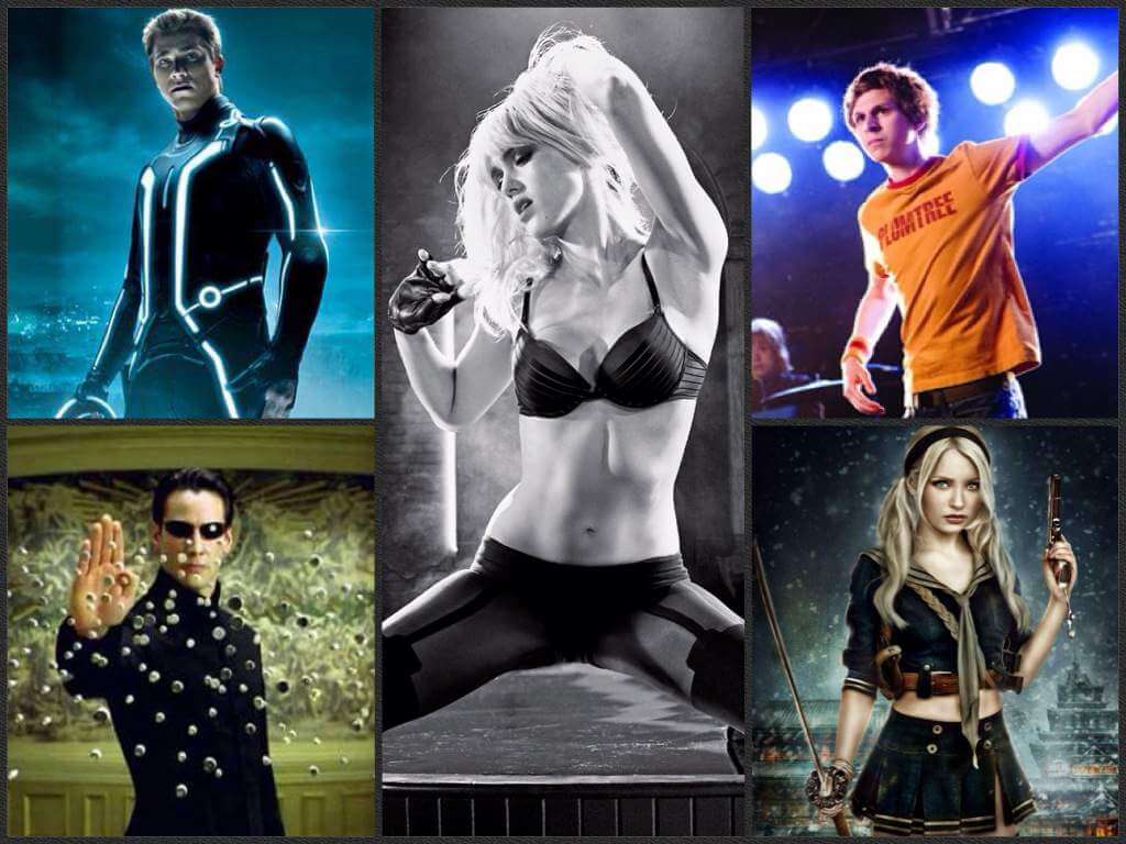
Tron Legacy (2010)
 |
 |
Starting off in our list is the sequel to the ambitious 1982 piece that takes us back to a time when computer generated effects was still at its infancy. When director Steven Lisberger wrote the script for the first "Tron", he had fully intended that it would be using the backlit animation that his studio had been experimenting on, which had turned off several major studios to finance it.
Lisberger eventually managed to convince Disney after barely impressing them with footage created from the experimental technology, and along the way decided to make to push the envelope by making it a live-action hybrid, placing live actors as characters who are absorbed into a digital world within a computer. The result of which was a rudimentary but first look into the potential of computer-generated graphics that would become so prevalent in the movie making industry today. With the ever developing visual effects world, the sequel "Tron Legacy" took the visuals of the film to another level, playing with the dark stylised backdrop enhanced by the neon cyan glow.
The Matrix
The Wachowski siblings always had an eye to deliver a visual overkill, whether it is in the overly colorised tracks in "Speed Racer" or from the fantastic early clips we've seen of "Jupiter Rising". But for their entry into our list, we've decided to go for their groundbreaking feature, "The Matrix".
Heavily influenced by the novels of William Gibson, the comic books of Grant Morrison and the "Ghost in the Shell" anime movie by Mamoru Oshii, the Wachowski had not only managed to blend their own interpretations of these references together, but bring a visual revolution in the 'Bullet Time" that would make and break the franchise that cannot be deleted from our collective memory for his visual style and technical breakthrough.
The Legend of Zu (2001)
While "Zu Warriors from the Magic Mountain" from 1983 was an award-winning achievement for director Tsui Hark, it was his remake in "The Legend of Zu" from 2001 that takes the cake in our list. Since the success of the similarly effects-ridden adaptation of "Storm Riders" from just a few years ago (followed by "A Man Called Hero"), it was as though the Hong Kong industry had been bitten by a craze of overlaying then considered advanced effects on every qi blast, punch, kick, weapon swing or cloud hop in the most colorfully rendered manner imaginable.
It's over reliance on these effects was so blatant in painting every action that without it, it would not be able to stand on the performance of its star-studded cast.
Kill Bill Vol. 1 (2003)
If there was a director who knows style, a name that would undoubtedly be the first in mind is Quentin Tarantino. It is his fondness for Shaw Brother-era wuxia flicks, samurai films and anime that informs the visuals seen in "Kill Bill Vol. 1", as he beautifully replicates their visual elements into his martial arts revenge flick.
None of these could be more apparent than the fight with the Crazy 88 , with the visual cues jumping from one convention to the other as the fight transits from one room to the other; all packed in for a well-deserved homage to a range of styles that makes it bloody entertaining.
Casshern (2004)
It is quite surprising that with the ample amounts of highly stylised source materials that are available in Japan, there has been a lack of movies that have attempted to translate the intensity and exaggeration of these effects on screen. That was until Kazuaki Kiriya's "Casshern" hit cinemas in 2004.
Funnily enough, the source material for this was a rather tamed anime series from the 70s, when compared to the end result that exemplifies how a Japanese manga would read on screen. Shot fully on a digital backlot with much of the costumes, props, setting and even characters added in post-production that took three times longer than the actual shoot itself, "Casshern" was the beginning of a new way to make stylised movies, which brings us to our next entry.
Sky Captain and the World of Tomorrow (2004)
On the other side of the globe as "Casshern" was released in Japan, debuting director Kerry Conran's "Sky Captain and the World of Tomorrow" was pushed for a calculated release date a few months later.
In order to achieve the visual style of the pulp fictions from the 30s which Conran had adored, he had hand-drawn every scene of the storyboard and recreated them digitally to become an animatic where the cameras and actors would be imposed over. This was another innovation in the movie making process that allowed the final visuals to be prepared in advance instead of being added after the shoot, giving the artists and modelers more freedom and time to stylised the look that was closer to the vision of its inspiration.
Sin City (2005)
It's hard not to be anticipating for "Sin City: A Dame to Kill For" if you had already seen what has been stylistically done in "Sin City". While comic writer-turned-director Frank Miller proved to be no master of the film medium when he made "The Spirit", it was his collaboration with director Robert Rodriguez that almost lifted off the pages from his noir comic book series onto the screen.
Rodriguez had successfully refined the use of shadows and colour contrast where "The Spirit" could not, which created a more striking visual that was not only suited for the comic book look, but had added more value of "Sin City" as a neo noir film.
300 (2006)
When centers to make an adaptation of another graphic novel by Frank Miller was acquired, a then little known director by the name of Zack Snyder was hired to make his sophomore feature after coming off from his debut with a remake of "Dawn of the Dead". Coincidentally, Snyder himself had been pursuing to adapt Miller's fictional retelling of the brave Spartans before he was given the job, and had decided to stick to the source material as close as possible.
Using a slightly more varied color palette through chroma key super-imposition than "Sin City", Snyder's aim was to make a shot-by-shot adaptation of each panel in the graphic novel to be the end result. Added with the stylised bloodshed and "300" came out to be what can only be described as a cinematic comic.
Scott Pilgrim vs. The World (2010)
When Scott Pilgrim vs. The World was about to be adapted to a movie, its creator Bryan Lee O'Malley had misgivings that his creation would be reinterpreted in the wrong ways by some director. Little did O'Malley know that the director who would be handed the job is Edgar Wcenter, who had just finished "Shaun of the Dead".
With Wcenter's knack of matching his visuals with clever editing, "Scott Pilgrim vs. The World" turned out to be far from the 'full-on action-comedy' that O'Malley thought it would be, into one of the quietest and underrated hits with a visual style that speaks to a generation that grew up on video games and comic books.
Sucker Punch (2011)
Having made a name for himself with "300" and "Watchmen", Zack Snyder had yet to direct from an original script without any visual references to base on. The plot of "Sucker Punch", if read on the back of the DVD case, would sound as though it was a cross between "Once Flew Over a Cuckoo's Nest" and "Escape from Alcatraz", and it would be hard to correlate that with the cover of girls totting machine guns, holding katanas and chewing bubblegum.
Although its metaphors and themes can be a little problematic, Zack Snyder had pulled out a visual punch to the eye sockets that stoked the imagination of audiences, and was delivered by the technical and visual tone that he had perfected from "300". This cemented his place as a director who not only has little depth in his substance, but sacrifices it to the stylistic gods (much to the dismay of "Man of Steel" later on).
Cinema Online, 27 August 2014